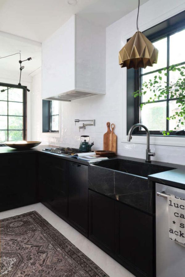
The color white has a very clean look which really suits spaces like the kitchen and the bathroom. There are lots of different ways in which white can be integrated into a room’s design and decor but a particularly stylish one has to do with backsplashes.
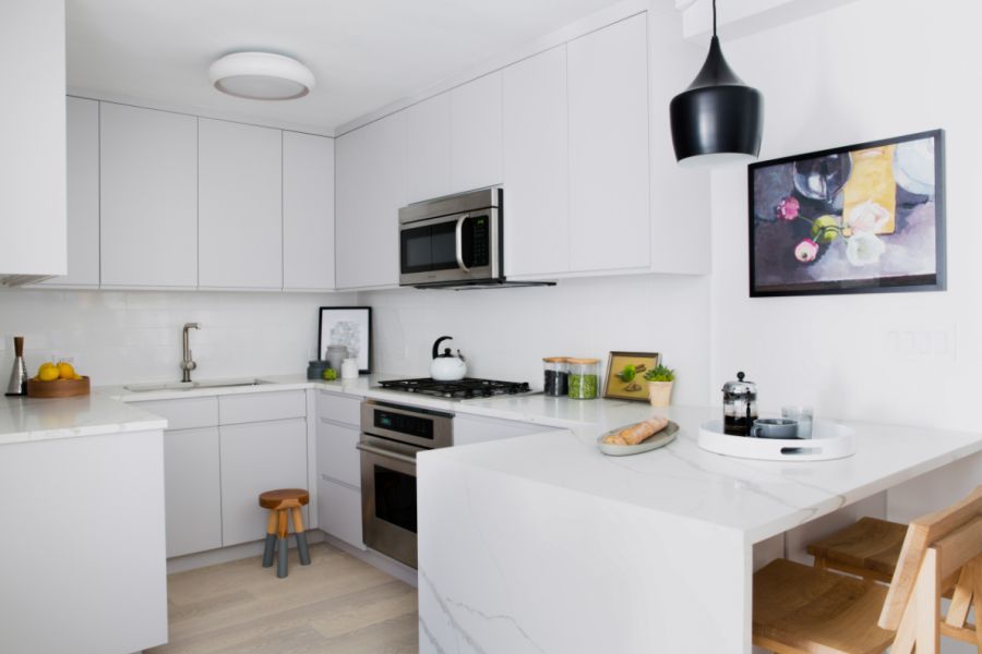
A white kitchen backsplash gives this space a fresh and open feel and also helps to bring out the beauty in other elements like the cabinetry, open shelves and some of the fixtures.
Beautiful white kitchen backsplash ideas
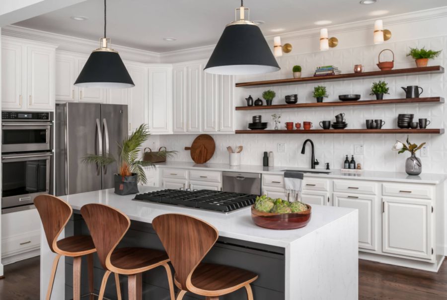
Hang a few floating shelves
The white backsplash helps these wooden open shelves stand out more and also creates a clean and bright backdrop for all the items put on display. Moreover, the three sconces at the top amplify the effect even more. This design by studio Tunde Decor can be adapted to suit a variety of styles.
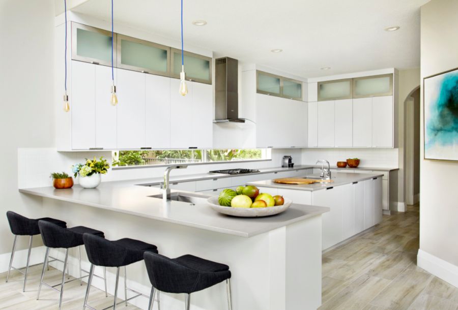
Add a small window
This contemporary design by studio Krista + Home features a white kitchen backsplash which ensures a smooth and seamless transition between the upper and lower cabinetry. At the same time it adds a bit of depth to the design. The long and very narrow window adds another layer of detail and also brings color into the mix which is very important in this case.
Vm decor Walnut Floating Shelves for Wall - Set of 3 Floating Wall Shelves Home
【Top notch Floating Shelves】We take on high-thickness wood sheets that are particularly predominant in hardness and solidness, as well as marginally water safe. Additionally, the drifting racks are planned with round corners, more secure than normal one. 【Premium Solid Brackets】By ethicalness of the choice and superb workmanship, the sections brag high steadiness. The dark drifting racks surfaces accompanies dark splash paint, conveying a lavish look, yet in addition highlighting waterproof, rustproof and scentless exhibitions.
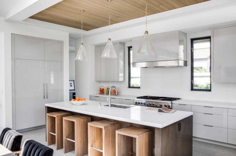
Keep it minimalist
Minimalism suits kitchens quite well. It also suits small spaces in general. This kitchen by State Street Design blends these ideas and you can really see how this works in its favor. Once again, the white backsplash blends in but also adds depth to the design. Similarly, the white marble countertops add a bit of diversity to the decor without changing the color palette.
Complement it with wooden surfaces
Another interesting design strategy is to give the kitchen white walls and to make the backsplash blend in as seamlessly as possible. In this particular case the design by Brandon Architects plays with warm wood accents to balance out the minimalism of the white walls and the cabinetry.
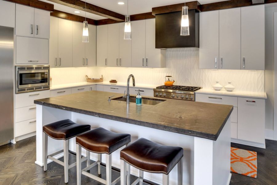
Play with accent lighting
A textured backsplash is a great way to add a bit of depth and detail to a kitchen without introducing a bold color or disrupt the balance in any way. This design by City Homes shows how some backsplash accent lights can put an emphasis on this and brighten up the whole room.
Pair it with contrasting cabinetry
Cabinetry in a contrasting color goes really well with white backsplashes because of the way in which they bring out the uniqueness in one another. This kitchen by Dan Rak Design has a stylish white and gray palette with a nice blend of textures and finishes.
Introduce warm neutrals
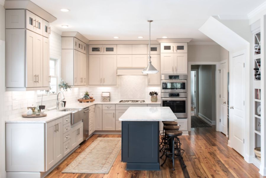
Another idea is to play with a few subtle color variations. For instance, there’s a very subtle difference between the walls, ceiling, cabinets and the backsplash of this mid-sized kitchen designed by studio Cabinetry of Pinehurst. The task lights also bring out the pattern and texture of the backsplash and the wooden floor anchors the whole space.
Go with a farmhouse design
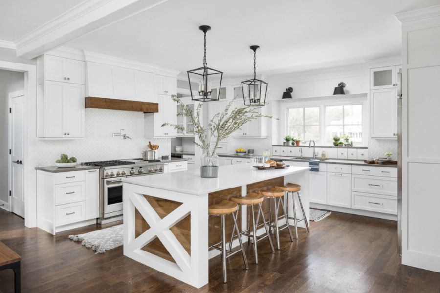
A concern could be that a white backsplash would make the kitchen look too simple and boring when paired with cabinetry that’s also white. As it has been demonstrated in some of the other examples but in this one as well, there are many ways in which that can be avoided. This kitchen by studio Picture Perfect House plays around with an eye-catching pattern but also has a farmhouse vibe which gives it a warm and inviting feel.
Try an off-white nuance
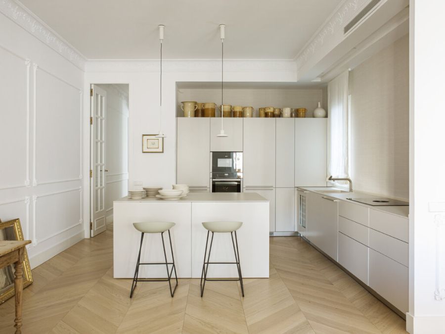
There’s something very refreshing and elegant about a white kitchen with a minimalist design. Of course, such a design can look quite boring and austere but you can quite easily avoid that. Use an off-white nuance, something that gives the space a bit of character and doesn’t look as mainstream. Also, make a statement with some stylish light fixtures or, in this case, a backsplash that goes all the way up. This is a design by studio BOA.
Use it as a backdrop
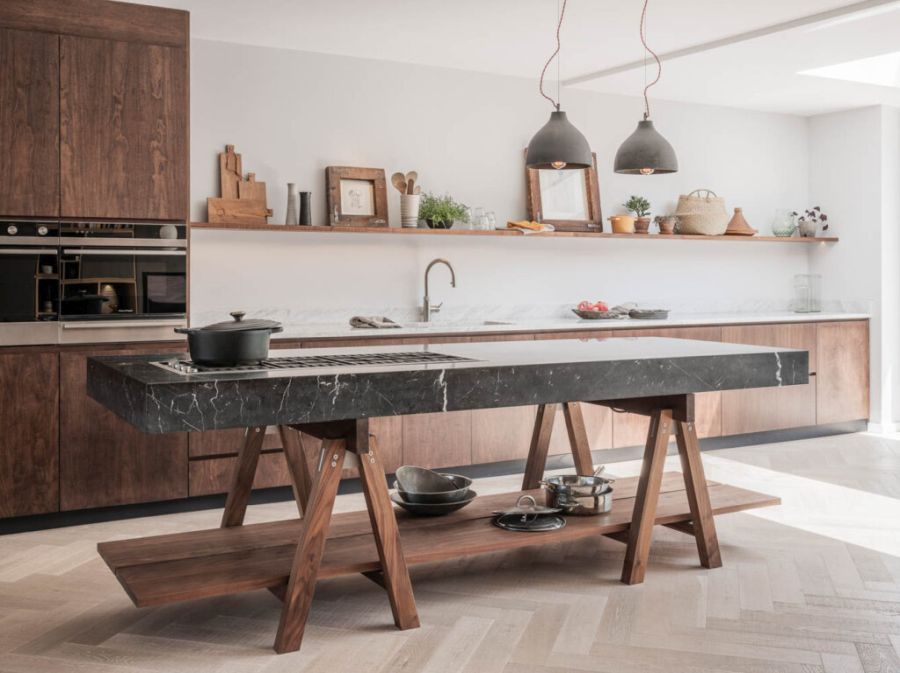
The white backsplash also makes a big statement in this contemporary space designed by Naked Kitchens. The long and thin shelf which goes across has a lightweight appearance and fills this wall nicely without covering it up. There’s also a smooth transition between the white wall and the ceiling and between the wooden cabinetry and the herringbone floor.
Play with pattern
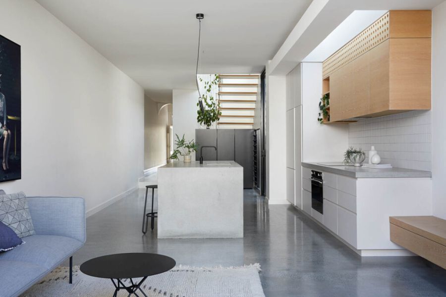
Small kitchens are challenging to design because it’s difficult to maintain the balance between aesthetic and functionality. An open concept design like this one by Tom Roberston Architects offers a bit more freedom because it leaves room for an island and allows the actual kitchen to be extended out into the living area. The backsplash in this case is actually a subtle visual separator which delineates the kitchen area from the rest of the open space.
Try a classic combo
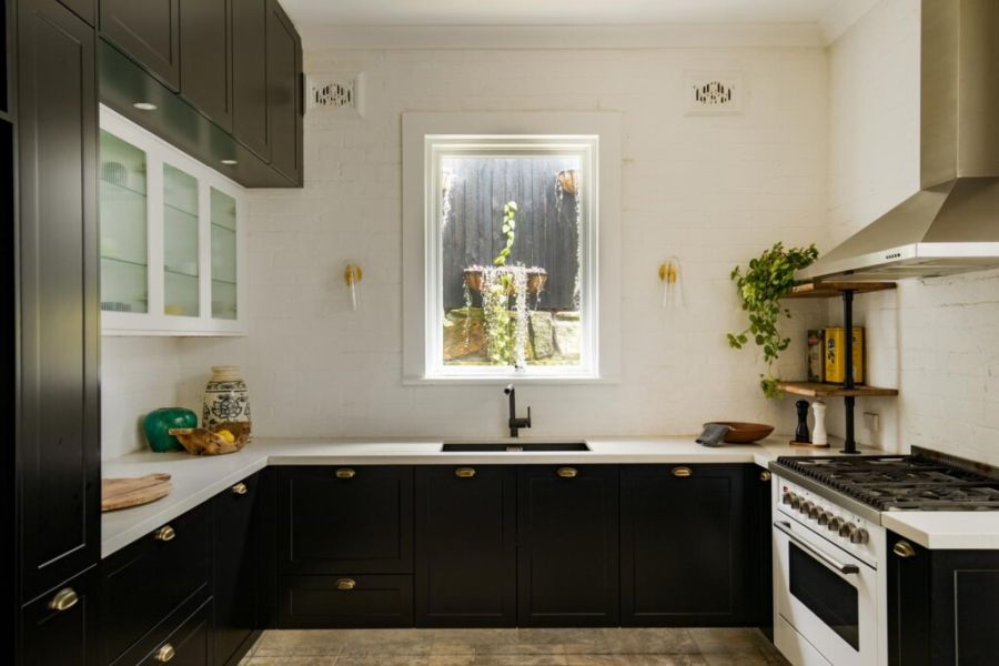
Extending the backsplash all the way up gives it a more dramatic effect and turns it into an eye-catching design element. Of course, in order for this strategy to work it would be best to not cover up the backsplash with big furniture pieces and this design by Jase Sullivan gives you an idea of you can achieve this look. The white backsplash frames the window and the two sconces keep the design symmetrical.
Introduce a bold third color
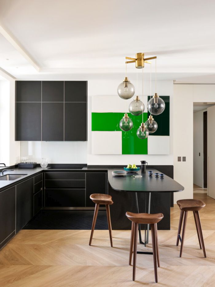
You might be wondering what other colors you can pair with a white kitchen backsplash. If you want to play it safe black is always a good option. Black and white is a timeless combo which suits all styles. You can also add a third color into the mix and it can be bold and vibrant tone to really set it apart from everything else. Check out how powerful this shade of green looks in this case by Le Berre Vevaud.
Use strong contrasts in your favor
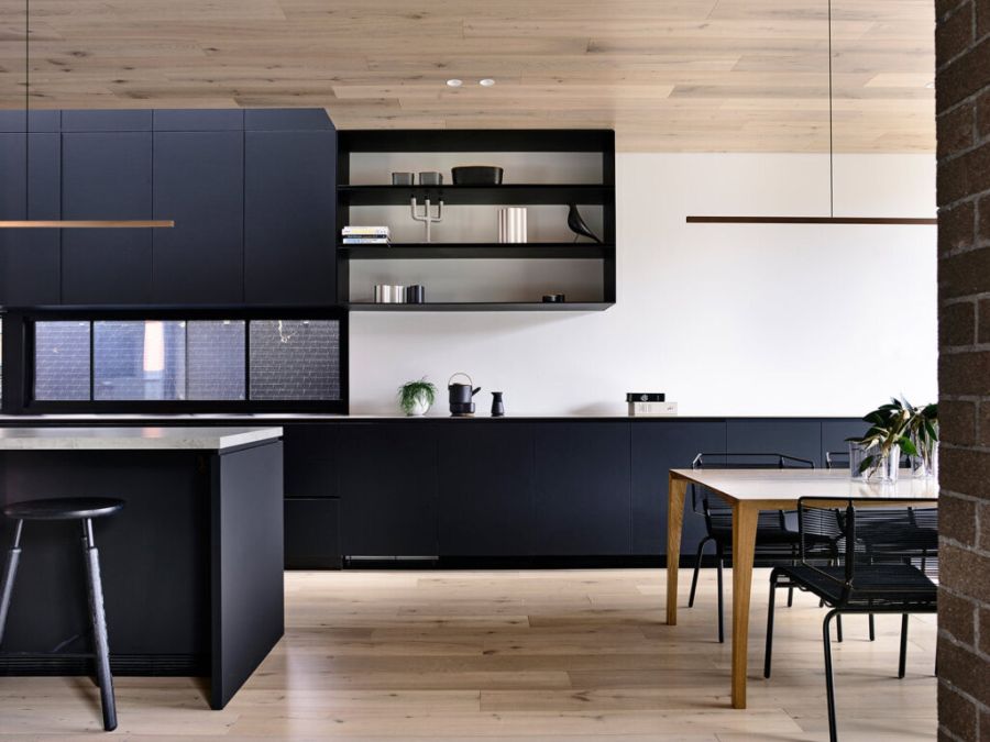
Here’s another great use of black and white in the kitchen but this time they’re paired with light wooden tones instead of bold accent colors. There’s no backsplash per se in this case but nevertheless, the effect is still there. What really sets this design by Jackson Clements Burrows Architects apart is the fact that there’s a wooden floor but also a matching ceiling.
Break it up with a few accessories
A white backsplash can also fit nicely in an eclectic kitchen. It would be an element that balances the decor and anchors the design. This beautiful example by Kelly Hopter Interiors can give you a few inspiring ideas for how to make this space feel inviting while still maintaining a design focused on functionality.


